
Hell Is Us: a developer-led look at design, combat, and atmosphere
Hell Is Us is a third-person action adventure developed by Rogue Factor and published by Nacon, set in a fictional country whose residents have vanished while strange creatures roam the streets. The game became notable during its long pre-release cycle for keeping its combat, exploration, and narrative systems under wraps until a public reappearance at a PlayStation State of Play showcase, as reported in a PC Gamer write-up on the surprise reappearance after two years of silence. The page on Wikipedia documents the same development path and release context. For a developer audience, the interest lies less in any single feature and more in how the team combined melee combat, drone companion mechanics, exploration without standard waypoint markers, and a mood-driven world to produce a deliberately disorienting adventure.
This article focuses on the production and design choices that give Hell Is Us its identity. It treats the title as a case study in building a contained action adventure, balancing melee weight against an unconventional companion system, and managing player navigation without the standard compass clutter. The aim is to help developers, designers, and technical artists understand which systems drove the experience and which trade-offs shaped the final product.
Project context and timeline
Hell Is Us was first revealed in 2022 and spent several years in a quiet pre-release phase before resurfacing publicly during a PlayStation State of Play. According to the PC Gamer article on the showcase, the title made a surprise reappearance at the broadcast after roughly two years without significant communication, with a new trailer and an updated release window. The Wikipedia entry on Hell Is Us reflects the same chronology, positioning the project as a single-player action adventure with melee and ranged tools, set in a rural European-flavored country. For production readers, the relevant facts are the studio size, the publisher relationship, and the platforms the team chose to support.
Rogue Factor is a mid-sized Canadian studio, and the development of Hell Is Us was supported by Nacon as publisher. The game shipped on PC, PlayStation 5, and Xbox Series X and S at launch. A development cycle of several years is consistent with the scope of bespoke environments, custom creature rigs, hand-authored lore objects, and a melee combat system that required repeated animation iteration. Studying the timeline helps frame the rest of the article: each major system discussed below had to coexist within the same relatively contained budget and schedule.
Platform and technology assumptions
The game targets current-generation consoles and modern PC hardware, which influences several decisions later in this analysis. Texture budgets, lighting approaches, and animation counts can assume a relatively generous memory and streaming profile compared with a cross-generation release. The same assumption affects the drone companion, whose behaviour was probably authored with sufficient CPU headroom to support reliable perception at thirty or sixty frames per second. The aim here is not to benchmark the game but to explain why certain systems are framed in a particular way when readers interpret design commentary.
Worldbuilding and the choice to remove a standard map
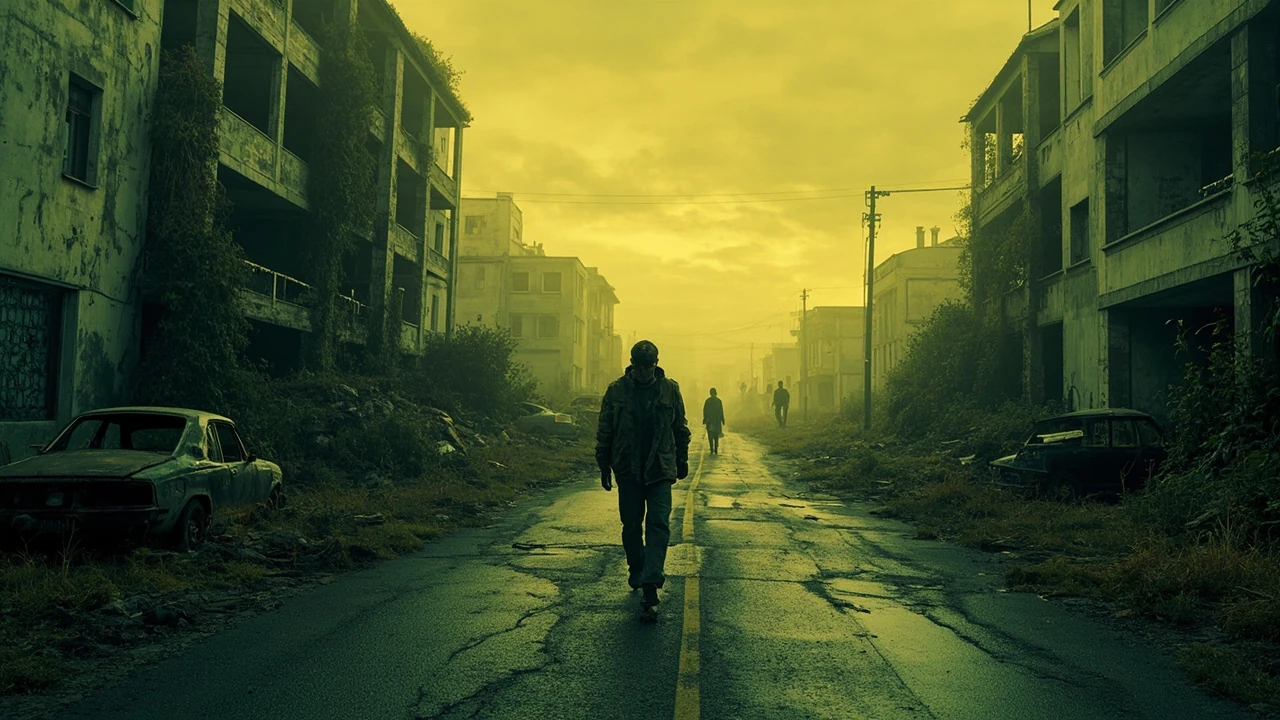
Hell Is Us opens in a small town called Senedra, inside the fictional country of Hadea. Players walk the streets of a region whose population has disappeared and where only hostile entities, the Hollow, remain. The setting is grounded in architecture that resembles mid-twentieth-century Central and Eastern European residential blocks, which carries a specific emotional weight. The game does not present the player with a fully revealed map, icons, or quest waypoints. Instead, players navigate by reading road signs, observing landmarks, and listening to ambient audio cues.
Removing the minimap is not a cosmetic decision. It changes the cognitive load of every traversal section. When designers strip a minimap, they have to redistribute the information normally carried by the HUD across other channels: clearer sightlines, legible environmental storytelling, distinct silhouettes for points of interest, and audio that telegraphs danger or safety. Hell Is Us leans on all four. The streets are wide enough that the player can see a meaningful stretch of road ahead, the skybox often frames a notable building at the end of a vista, and certain audio layers change as the player approaches enemy territory.
The worldbuilding also informs the combat frame. The game presents the world as post-collapse but inhabited, with ritual objects, abandoned personal effects, and small monuments scattered through the environment. Reading those objects is part of progression. Players who ignore environmental storytelling are not punished, but they are gated: the lore system feeds certain unlocks and dialogue branches. Designers can study this as a soft gating model in which narrative attention translates into mechanical reward.
Combat design: melee, drone, and balance philosophy
Combat in Hell Is Us pairs a melee weapon in the player’s right hand with a small autonomous drone hovering near the protagonist’s left shoulder. The melee weapon is a single slot for most of the game, although a second arm is later available for a second melee tool. Each weapon category carries a distinct animation set, weight, and stamina cost. The drone fires independently when a lock is acquired and can be upgraded with modules that change its projectile type, rate of fire, or behaviour against specific enemy classes.
The pairing matters. Without the drone, the melee combat reads as a slow, deliberate souls-adjacent system. With the drone, the loop becomes a different beast: the player has to manage melee timing while a separate AI-driven ally exerts pressure on the same targets. Designers can extract a few clear lessons from the structure.
Why a single melee slot works
Limiting the player to one melee weapon at a time is a deliberate balance choice. It narrows the player’s decision space to timing, positioning, and stamina, which keeps the loop readable. The game still preserves variety through weapon archetypes rather than weapon inventories, so two players with the same archetype can have different runs based on upgrade choices, drone configuration, and exploration order. The trade-off is a smaller surface area for build diversity, which the developers compensate for by varying the drone’s modules and the stat growth derived from equipment.
Why the drone is an AI ally and not a separate resource
The drone is treated as a passive system rather than a summon. It does not drain a resource the player manages mid-fight, and it follows a stable behaviour tree that targets the player’s current threat. This removes a layer of micromanagement that often complicates similar systems. The cost is that the drone cannot execute player-defined tactics, which limits expressiveness. For developers, the comparison is useful: a deterministic ally keeps encounters predictable for designers and easier to test, while a player-driven ally adds variety but multiplies QA scope. The team’s choice points toward a build with finite QA resources where combat encounters had to be tuned to a stable pattern.
Exploration systems and the lost compass
Hell Is Us removes the compass and the on-screen quest tracker. The replacement is a layered system of environmental cues: visual landmarks, in-world documents, audio shifts, and contextual dialogue when the player stands near a relevant location. The system feels disorienting in the first hour, then becomes a different kind of clarity. Players learn to read the world instead of reading the HUD.
For developers, the production consequences of this decision are significant. Every system that normally relies on a map or compass has to be rebuilt or replaced. Fast travel is gated by discovering specific in-world vehicles rather than selecting a discovered icon. Quest updates arrive through journal entries that the player must read. Side activities, such as optional lore objects, are placed on sightlines rather than pinned to the world map.
Environmental readability checklist
A useful internal reference for any team considering a no-compass design is the following set of readability checks. Each check answers a concrete question about whether the environment can carry information that a HUD would otherwise provide.
- Sightline check: from the player’s current position, is a meaningful landmark visible at a distance that justifies movement?
- Silhouette check: do points of interest have distinct silhouettes that read against the background at varying light conditions?
- Audio shift check: does ambient audio shift in tone or density as the player approaches a known event location?
- Path junction check: at each major fork, is one path visually prioritized by scale, color, or material so the player can guess the intended route?
- Reward density check: are optional rewards placed on sightlines rather than hidden behind corners, so that attentive players are rewarded without breaking pacing?
Hell Is Us satisfies most of these checks in its main town and surrounding countryside, although a few interior corridors rely on linear design to substitute for environmental cues. The pattern is worth noting because it shows that a no-compass design is not a single decision; it is a discipline that has to be applied to every authored space.
Enemy design and the Hollow
The Hollow are the primary adversaries in Hell Is Us. They are humanoid shapes drawn from local mythology and from the trauma of the country’s collapse. Each Hollow variant has a distinct silhouette, movement pattern, and aggression profile. The game does not introduce a deep bestiary in the traditional sense, but it differentiates encounters through composition: how many Hollow of which class appear, what terrain they occupy, and whether the drone’s current configuration is suited to the engagement.
Encounter design therefore leans on a few key variables. Terrain determines sightline length and available dodge space. Composition determines pressure on the player’s stamina. Drone configuration determines whether the player can hold a choke or has to retreat. The combination produces encounter variety without requiring a large bestiary, which is an efficient use of animation and rigging budget.
How to read an encounter at a glance
The following table captures the typical signals a player uses to interpret an encounter in Hell Is Us and the mechanical implication of each signal. It is not a numeric balance sheet; it is a translation of design intent into observable cues.
| Signal | What the player sees or hears | Mechanical implication |
|---|---|---|
| Hollow density | More than three silhouettes in a single open area | Stamina pressure on melee, drone must spread damage |
| Armed Hollow | Visual cue such as a blade or staff | Parry or dodge priority, drone cannot be relied on alone |
| High ground Hollow | Enemy on a roof or wall | Ranged weapon or drone elevation needed, melee is unsafe |
| Quiet zone | Audio shifts to wind and ambient insects | No active threat, but tension remains because the rule is local |
| Combat transition | Music swells as the first Hollow aggro | Player has a small window to reposition before full engagement |
The encounter vocabulary is small, but it is consistent. Players learn the grammar of a fight within the first two hours, and the rest of the runtime is a variation on that grammar rather than a string of unrelated encounters.
Narrative structure and the journal system
Hell Is Us frames its story as a slowly revealed national trauma. The protagonist is a returning émigré searching for his parents, and the country is a mirror of his personal loss. The narrative does not rely on cinematic cutscenes. Most plot development is delivered through in-world documents, short dialogue beats, and environmental storytelling. The journal system functions as the player’s only persistent record of lore.
For narrative designers, the choice to keep cutscenes short and to push most storytelling into readable material is a production decision. Long cinematics are expensive to localise, expensive to QA across platforms, and limit the player’s agency. Documents, in contrast, are cheap to author, easy to translate, and consume very little frame time. The trade-off is that players who do not read will miss significant parts of the story, which can produce an audience split. The development team accepts that split, and the resulting game feels closer to a contemplative adventure than a blockbuster action title.
Document design as a level of progression
Documents in Hell Is Us are not generic flavour text. Each is a small puzzle, a character study, or a piece of historical context. Designers can adopt a useful rule: every document should answer at least one of four questions when it is read. If it does not, it is decoration rather than narrative, and it can be cut without harm to the experience.
- Question of place: does the document reveal a fact about the world that the environment cannot show?
- Question of motive: does the document explain why a character acted in the way the player observed?
- Question of time: does the document place the current moment in a longer timeline the player can compare to other documents?
- Question of consequence: does the document change how the player should approach the next area, whether mechanically or emotionally?
This is one of the easier production disciplines to apply, and it explains why the journal entries in Hell Is Us feel purposeful even when the world is quiet.
Production pipeline considerations
A game of this kind is built on a pipeline that has to balance bespoke authored content against the need for repeatable encounters and explorable spaces. The pipeline is worth describing because it illustrates how the design decisions above translate into real production work.
Environment pipeline
Environments are modular but heavily art-directed. The team appears to have used a small set of building kits for the residential and civic structures, then placed them in hand-authored compositions to maintain readability. Texture work leans on real-world references for concrete, plaster, and tile, with a muted palette that supports the overcast lighting model. The lighting model itself uses a single dominant weather condition with subtle variation, which keeps the rendering budget predictable across the world.
Animation pipeline
Animation is the most expensive part of the combat system. Each weapon archetype needs a unique set of strikes, blocks, dodges, and locomotion. The drone’s behaviour is cheaper because it is procedural, but the drone’s hit reactions and projectile impacts still need to be tuned. The team can save significant time by limiting the number of weapon archetypes to the ones that are mechanically distinct rather than cosmetically distinct, which the game appears to do.
Audio pipeline
Audio carries a large share of the navigation load. Ambient layers for wind, distant voices, and infrastructure hum have to be authored per region, and combat music has to be mixed so it does not overpower the drone’s audio. The audio team has to author adaptive transitions that respond to player state without relying on a hard state machine, because a too-rigid system will break the contemplative pacing the rest of the game is trying to maintain.
Technical artist notes: rendering, lighting, and performance
Hell Is Us runs on a custom or heavily modified engine pipeline with current-generation budgets. The rendering approach uses baked global illumination for most interiors and real-time lighting for exteriors, which is a common production split that keeps outdoor frame times predictable. Shadow cascades are tuned to a relatively short distance, with the long-range detail handled by screen-space and lighting proxies. This produces a clean look at the cost of fine detail in the far field, a trade-off most players will not notice because the world does not require long-range detail to be readable.
Post-processing is restrained. Color grading leans into the desaturated palette without crushing blacks, which keeps the silhouette readability intact in low-light interiors. Bloom is conservative so that the drone’s projectiles remain visible. Screen-space reflections are used sparingly in interiors where puddles and tiles are visible, but they are not used in the open countryside because the cost would be hard to justify.
Performance budget per system
The following table summarises the kind of budget a project of this scope can sustain. Numbers are illustrative ranges, not measured results, and they reflect typical mid-budget current-generation targets for a thirty to sixty frames per second target on console and mid-range PC hardware.
| System | Approximate budget on console | Design consequence |
|---|---|---|
| Draw calls per frame | Several thousand for outdoor scenes | Modular kits with instancing preferred over unique props |
| Shadow map updates | Cascaded, short range | Authored lighting must respect the visible shadow distance |
| AI tick rate | Stable, low-frequency update for Hollow | Encounter design assumes slow patrol, not swarms |
| Animation cost | Single hero rig with archetype swaps | Weapon variety is finite, and the team has to commit to it |
| Audio voices | Moderate number of ambient voices | Adaptive mix must avoid voice stealing for combat |
The numbers are not the point. The point is that each budget constrains a design choice, and a project like Hell Is Us is the result of accepting those constraints in advance. Trying to retrofit a no-compass design onto a system that was not built for it rarely works, because the budgets are already spent by the time the design discussion happens.
Player experience and pacing
The game is paced as a slow burn. The opening hours are deliberately quiet, and the difficulty curve rises as the player acquires new drone modules and new weapon archetypes. The pacing is consistent with a project that wants to be remembered for tone rather than for mechanical density. Players looking for a long, varied skill tree will find less here than in a typical action RPG. Players looking for a contained, atmospheric adventure will find more than they expected.
For producers, the lesson is that pacing decisions are not separable from design decisions. A no-compass world is slower to traverse, which forces combat to be more deliberate, which forces the difficulty curve to be flatter than usual. Each of those choices is a chain, and the chain has to be designed from the start.
Comparison with adjacent design patterns
Hell Is Us can be read against three adjacent design patterns. The first is the souls-like action RPG, which shares melee weight and stamina management. The second is the open-world action adventure, which shares a large world and a high density of optional content. The third is the contemplative first-person or third-person adventure, which shares the slow pacing and the emphasis on reading the world. The game borrows from each pattern without committing fully to any of them.
| Pattern | What Hell Is Us borrows | What it leaves behind |
|---|---|---|
| Souls-like | Melee weight, stamina, parry timing | Runbacks, soul-equivalent currency, build depth |
| Open-world adventure | Large world, optional content, side objectives | Map icons, quest trackers, fast travel network |
| Contemplative adventure | Slow pacing, document-driven narrative | Puzzle complexity, branching dialogue trees |
The selective borrowing is itself a design choice. The team is signalling that the experience will feel familiar in specific ways and unfamiliar in others, and that the unfamiliar parts are deliberate. Players who want pure mechanical depth will not find it here, and players who want pure narrative calm will not find that either. The intended audience is somewhere in between.
Key design decisions and their trade-offs
The following list captures the design decisions that most clearly shape the experience. Each decision comes with a trade-off, because no decision in game development is free. A reader who can accept the trade-off is part of the intended audience. A reader who cannot is part of the audience the team did not target.
- No minimap: trade-off is slower traversal in exchange for environmental reading.
- Single melee slot: trade-off is limited build diversity in exchange for a readable combat loop.
- Drone as a passive ally: trade-off is reduced expressiveness in exchange for predictable encounters.
- Short cutscenes: trade-off is audience split in exchange for cheaper localisation and faster QA.
- Document-driven narrative: trade-off is reader fatigue in exchange for player-driven discovery.
- Muted color palette: trade-off is lower contrast in some scenes in exchange for sustained tone.
These decisions are not unique to Hell Is Us, but the combination is. The combination produces a specific kind of game that other titles can approach but not replicate exactly without making the same trade-offs in the same order.
Where the design still has room to grow
Two areas of the design remain underdeveloped by the team’s own choices. The first is enemy variety. The Hollow are atmospherically effective, but their mechanical vocabulary is small, which can produce encounter fatigue in the late game. The second is the drone’s late-game tuning. By the end of the runtime the drone becomes a strong force, and some encounters reduce to a question of whether the player can stay alive long enough for the drone to do its work. Both areas are fixable in a sequel or expansion, and both would benefit from a slightly larger budget for animation and AI work.
Neither point is a criticism. They are the natural limits of a contained project, and they are part of why the project feels coherent. A larger scope would have produced more systems, but the same tone would have been harder to maintain.
Practical takeaways for developers and designers
The clearest lessons from Hell Is Us for working developers are not about any single feature. They are about the discipline of making a small number of design choices and accepting their consequences.
- If you remove a HUD element, you have to redistribute its information across the environment, audio, and pacing. The redistribution is the design, not the removal.
- If you give the player a passive ally, you have to design encounters around that ally’s behaviour. The ally is part of the difficulty curve.
- If you rely on documents for narrative, every document has to answer a question. Decoration is the enemy of pacing.
- If you build a small bestiary, you have to vary encounters through composition and terrain, not just through enemy count.
- If you commit to a muted palette, you have to keep silhouette readability as a non-negotiable rule in every authored space.
These lessons are portable. A team working on a different genre can apply them with different content, and the result will be a game that feels deliberate in the way Hell Is Us does.
Closing notes on tone and intent
Hell Is Us is a useful case study because it shows what a mid-budget single-player project can achieve when the design is committed from the start. The combat, the exploration, the narrative, and the audio all serve the same goal, and the trade-offs are visible. A developer audience can learn as much from the trade-offs as from the systems themselves. The next step for any reader is to play the game with the design lens active and to test each of the lessons above against the experience. The game rewards that kind of reading, and it leaves enough room for the reader to disagree.
Frequently asked questions
What kind of game is Hell Is Us?
Hell Is Us is a third-person action adventure set in a fictional country whose population has disappeared. It pairs melee combat with a passive drone companion and replaces the standard map and quest tracker with environmental readability. The pacing is slow, the tone is dark, and the narrative is delivered largely through in-world documents rather than long cutscenes.
Who developed and published Hell Is Us?
The game was developed by Rogue Factor, a Canadian studio, and published by Nacon. It was released on PC, PlayStation 5, and Xbox Series X and S, and its long pre-release period included a public reappearance at a PlayStation State of Play showcase after roughly two years of limited public communication.
Why does the game not have a standard map or compass?
The design team chose to remove the minimap and quest tracker to push navigation into the environment itself. The trade-off is slower traversal in the early hours, but the long-term effect is a more contemplative pacing and a stronger sense of reading the world. The team had to author every space with sightline, silhouette, and audio cues that compensate for the missing HUD.
How does the drone companion work in combat?
The drone hovers near the protagonist’s left shoulder and targets the player’s current threat automatically. It does not consume a resource mid-fight and cannot be commanded directly. Players can upgrade the drone with modules that change its projectile type, rate of fire, or behaviour against specific enemy classes, which provides a soft form of build variety without complicating the combat loop.
Is Hell Is Us a souls-like game?
Hell Is Us borrows some mechanics from the souls-like genre, including melee weight, stamina management, and parry timing, but it does not commit to the genre’s runbacks, currency systems, or build depth. The result is closer to a slow-paced action adventure with selective souls-like ingredients rather than a pure souls-like.
What is the tone of the game?
The tone is dark, contemplative, and quietly oppressive. The setting is a post-collapse country that resembles mid-twentieth-century Central and Eastern European residential blocks. The color palette is muted, the lighting is overcast, and the audio is dominated by wind, distant voices, and infrastructure hum. The game does not lean on jump scares or loud music for tension.
How does the narrative work?
The narrative is delivered through short dialogue beats and a journal system that records in-world documents. The protagonist is a returning émigré searching for his parents, and the country’s collapse is framed as a mirror of personal loss. Documents are not generic flavour; they answer questions about place, motive, time, or consequence, which keeps the journal feeling purposeful.
What are the Hollow?
The Hollow are the primary adversaries in Hell Is Us. They are humanoid shapes drawn from local mythology and from the trauma of the country’s collapse. Each variant has a distinct silhouette and aggression profile, and encounters vary by composition and terrain rather than by sheer enemy count. The Hollow are designed to feel uncanny rather than spectacular.
What platforms is the game available on?
Hell Is Us is available on PC, PlayStation 5, and Xbox Series X and S. The current-generation target allows the team to use texture budgets, lighting approaches, and animation counts that would not be feasible on older hardware, which is one reason the no-compass design and the drone behaviour are framed in the way they are.
What is the design lesson for developers?
The clearest lesson is that small numbers of well-supported design choices produce a more coherent experience than large numbers of half-supported ones. Removing the minimap, limiting the melee slot, and treating the drone as a passive ally are all small decisions on paper, but each forces a chain of consequences that shapes the entire project. The chain is the design.
Leave a Reply